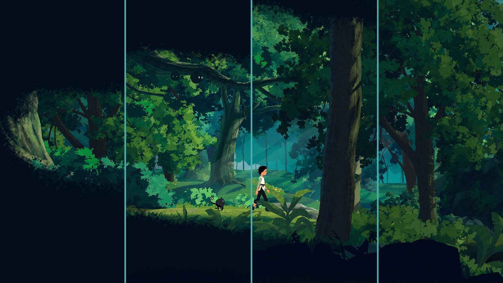
Recently we at Fully Studios launched a site for the beautiful game Planet of Lana. One of the tasks was to create a image reveal effect for the style-frames / screenshots. You can see it in action here if you scroll down on the page.
TLDR;
Create a sprite sheet. Wrap your image in a element that you in CSS adds a mask-image to, and set mask-size: 400% 400%. Animate the mask-position using CSS keyframes.
The sprite
Create a image sprite-sheet, ex 4×4 sprites with the mask. Usually you need a quite big image, like 2048x2048px. But experiment what works best with your image, and also make sure your targeted devices supports that high resolution. The mask should have a transparent background (alpha channel) and the mask object should be black (and end in totally black / no alpha).
By default this means the alpha channel of the mask image will be multiplied with the alpha channel of the element.
MDN
Here’s an example:

Then create a element that you wrap your image in, and add a CSS mask-image property to it, set it’s mask-size to 100% * the number of sprites in each axis, in this case 400% 400%. And set the mask position to the top-left sprite:
.image-reveal {
  mask-image: url(/images/example-mask.png);
  mask-size: 400% 400%;
  mask-position: 0% 0%;
}
To trigger the keyframes animation, we use a JavaScript Intersection Observer API lissener when you have scrolled to the image (see this example how it could work), and attaching a visible class to the container. To this selecto we write a aniamtion declaration, and uses a steps(1) timing-function (easing) to make the flip-book animation that we want (else they will just animate smoothly in a very weird way):
.visible.image-reveal {
  animation: mask-reveal 1s 0s steps(1) forwards;
}
Lastly is the actual keyframes declaration for a 4 x 4 sprite sheet. Here we animated the mask-position so it goes from left to right, sprite 1, 2, 3 and 4, then it jumps down to row 2 (at 22%), and reveals sprite 5, 6 ,7 , 8 etc until it reaches the last sprite in the bottom right.
@keyframes mask-reveal {
  0% {
    mask-position: 0% 0%;
  }
  10% {
    mask-position: 33.33% 0%;
  }
  14% {
    mask-position: 66.66% 0%;
  }
  18% {
    mask-position: 100% 0%;
  }

  22% {
    mask-position: 0% 33.33%;
  }
  26% {
    mask-position: 33.33% 33.33%;
  }
  30% {
    mask-position: 66.66% 33.33%;
  }
  35% {
    mask-position: 100% 33.33%;
  }

  40% {
    mask-position: 0% 66.66%;
  }
  45% {
    mask-position: 33.33% 66.66%;
  }
  50% {
    mask-position: 66.66% 66.66%;
  }
  55% {
    mask-position: 100% 66.66%;
  }

  60% {
    mask-position: 0% 100%;
  }
  65% {
    mask-position: 33.33% 100%;
  }
  70% {
    mask-position: 66.66% 100%;
  }
  75%,
  100% {
    mask-position: 100% 100%;
  }
}
P.S
Don’t forget to wishlist the game on Steam here!

Leave a Reply